Abelara
Brand Identity and Landing Page
Poised to introduce radical efficiency for manufacturing enterprises, Abelara wanted to shout their message from the rooftops. Their true distinction is an in-person, boots on the ground approach that seamlessly integrates ownership, management and the factory floor. In a visually austere tech-based category, Abelara chose to emphasize this point of difference by showcasing humanity with editorial-style photography, augmented with schematic-inspired visuals, energetic colors and gradient glows.
Role: Creative Director and Designer


Abelara’s logo mark is inspired by engineering schematics and is composed of directional arrow shapes representing their
points of difference: enterprise-wide integration from the bottom up, top down and from left to right.
Abelara is a fusion of the word Elara (one of Jupiter’s moons) and the prefix “Ab-” meaning away from.
It is evocative of breaking away from convention and embarking on a journey of discovery. Custom thin rounded sans serif letterforms convey trust and nimbleness.
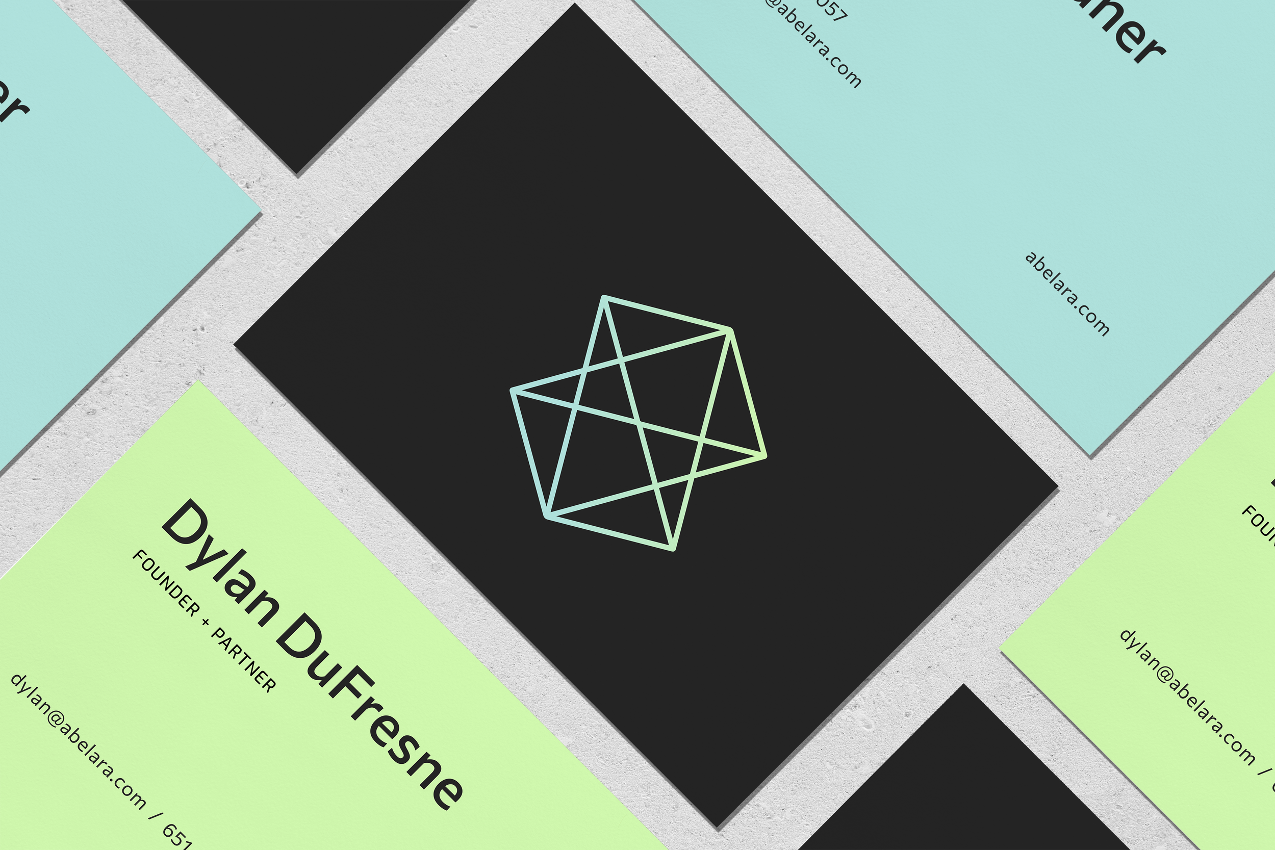
A set of ethereal line illustrations and colorful gradients help to draw focus and interest in an approachable way. Our client noted there’s something deeply ingrained and comforting about this diagrammatic imagery for their engineering and manufacturing audience.


A human-centric brand
An Abelara mantra that guided the branding process was people will always come before the tools. To emphasize this, photography choices celebrate the full cross-section of people that run a modern enterprise. Subjects are depicted candidly to create an editorial feel. To further unite the library, they were given an ownable tinting treatment.

A striking set of iconic illustrations was created exclusively for bolder use on black backgrounds.