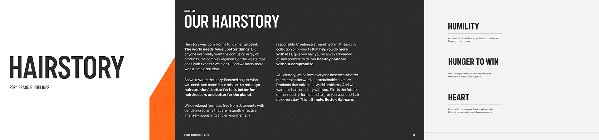
Hairstory
Brand Design + Strategy, Packaging Design
As an innovative haircare brand with a breakthrough soap-free hair cleanser, Hairstory came to us looking to rethink their place at the crowded shelf. We partnered with them to imagine and deliver a challenger brand that would distinguish them from the lather-rinse-repeat pack.
Role: Associate Creative Director at Tether


Punctuating our difference
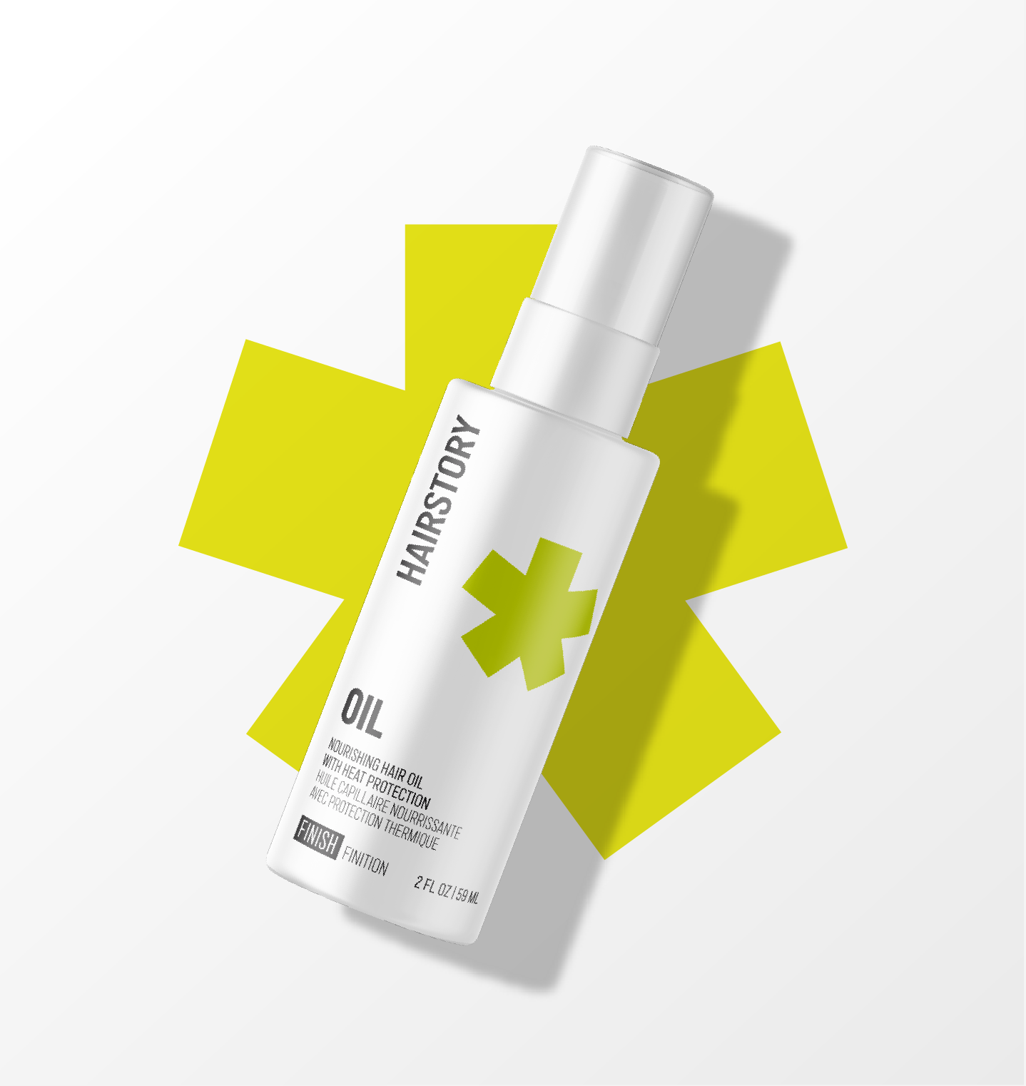
We crafted a robust, flexible visual identity, including logo and secondary marks, bold typography and revitalized color palette to capture the distinctive and dynamic nature of Hairstory. At the center of the system are a series of punctuation symbols that nod to the storytelling side of the brand and engage and elevate the product to stand out online and on hairdressers’ shelves.


As we approached packaging and product forms, we chose a cohesive set of square-shouldered white forms, which provided the perfect canvas for our stark, modern kit of parts.
We looked at everything from incorporating the newly developed logotype and mark into primary and secondary packaging to codifying naming conventions.

As part of the larger branding exercise, we helped to reimagine the New Wash dispenser and provided input to Hairstory’s packaging manufacturer. Their final product made the act of refilling and dispensing much more intuitive, elegant and bespoke.


For final delivery, we facilitated a comprehensive brand package for download which included brand guidelines, brand assets (logos, iconography, supporting expressions), all packaging files and further guidance on web usage and fonts.